
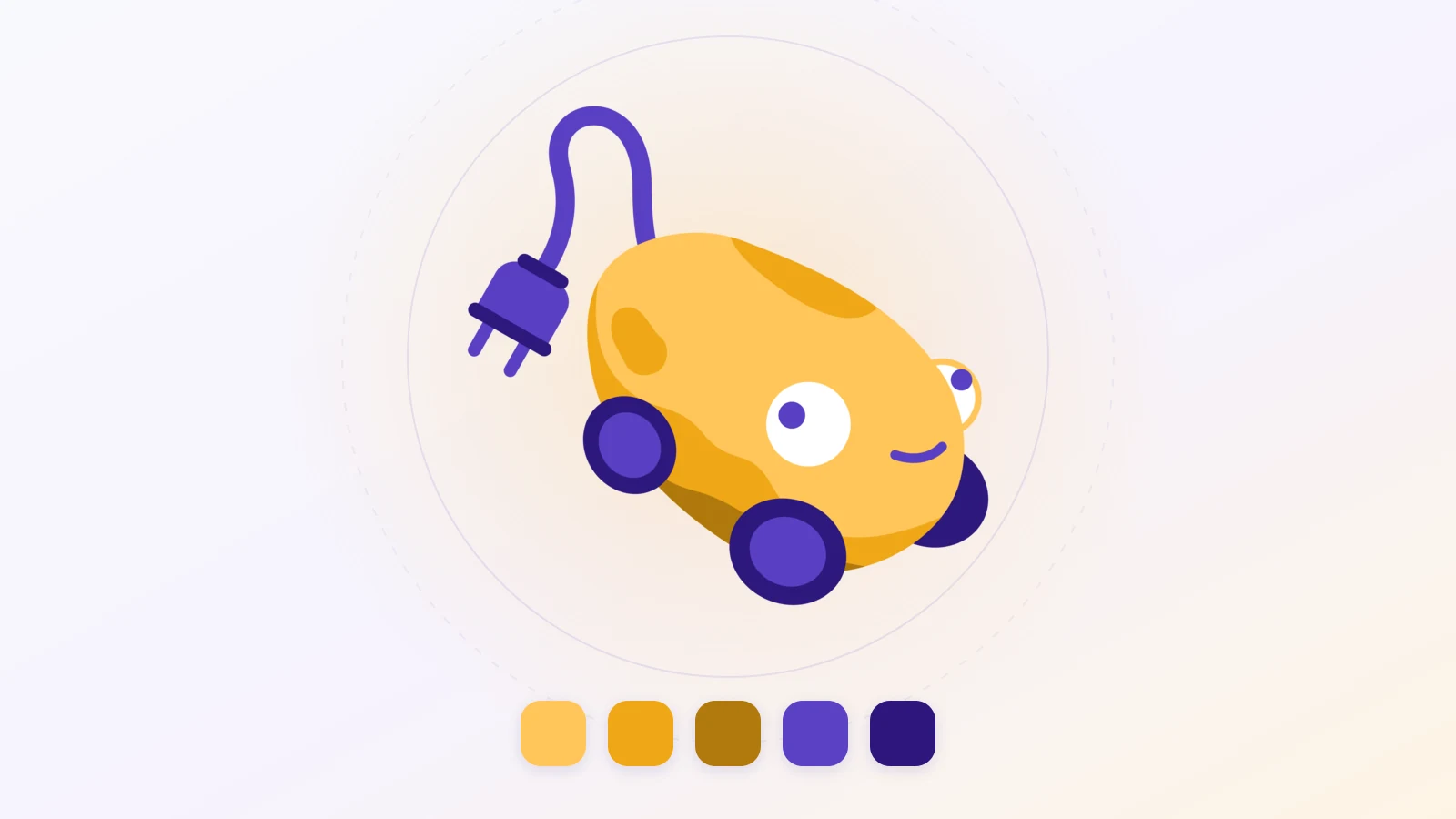
The PotatoCharge logo is a potato. It has two wheels, one round eye, a lopsided smile, and a cable trailing behind it that ends in a plug. You meet it at the top of every page, in your browser tab and on the app icon. It did not come out of nowhere: Jeanne Sadzot drew it.
A name that called for a face
The name came before the image, with its wink between the potato and the charge. It still needed a shape. For a platform about charging between neighbours, a blue angular monogram would have rung false. We needed something you'd want to look at a second longer than necessary.
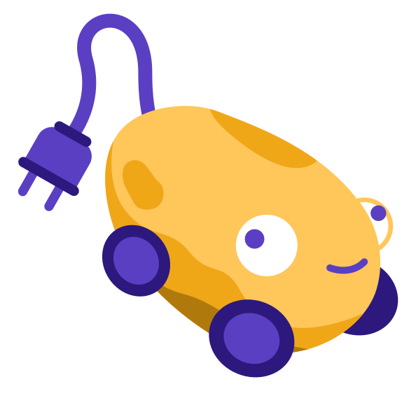
The potato rolls, it's plugged in, and it looks pleased about it. The whole point of the platform sits in that drawing, without a single line of copy.
Who is Jeanne Sadzot
She works under the name ESJY. On her site she describes herself as passionate about anything creative and forever picking up new hobbies. What she takes on reaches well beyond a logo: graphic and web design, video editing, writing, photography, interviews, layout. Her graduation project, an entire website about the space race whose illustrations, design and copy are all hers, already gave the measure of that appetite.
What she has done elsewhere
In 2024, the poster she designed for the EAIE conference won the best poster award. The year after, her work took third place. Two editions, ranked both times.
She also owns the identity of the CIVIS Days, an event that gathers European higher education players in a different city each year. Four editions so far, from 2023 to 2026. Each time a visual representing the host city, then every derivative: posters, roll-ups, postcards, goodies, social media artwork. She then travels to the event to photograph it and run the interviews. For the 2025 stand she drew a giant "Where's Wally", printed six metres by two and a half, with the alliance's institutions hidden inside it.
The rest of her portfolio covers as much ground: a visual redesign of an existing product for IT.SCHOOL, with an icon set and a new palette; the storefront of a vintage clothing shop, where she handled the logo, the design and the photography; logos for a tattoo artist, a sweatshirt brand, a medical platform, a role-playing game. Since 2025 she takes her watercolours on every trip outside Belgium, with a rule of bringing back at least one.
An identity that carries the positioning
A logo is more than a nice drawing, it states an intention. Our potato isn't trying to impress anyone. It says the platform means to be close, readable and free of jargon, which is exactly the tone citizen charging calls for: infrastructure that belongs to the people who make it possible, not a brand looking down at its users.
Thank you Jeanne
Thank you for this character, which does a lot for the welcome we get when we explain the project. If you're looking for someone for a visual identity, a website, a layout or a photo report, her portfolio is worth your time, and she can be reached on LinkedIn and on Instagram.